Computing the threshold of the surface code
In this tutorial, we will show how to compute the code-capacity threshold of the 2D surface using PanQEC.
[1]:
from tqdm.notebook import tqdm
import pandas as pd
import numpy as np
import matplotlib.pyplot as plt
%matplotlib inline

from panqec.simulation import read_input_dict
from panqec.analysis import Analysis
Running the simulations
We first provide the dictionary:
[2]:
input_data = {
    'ranges': {
        'label': 'Toric 2D Experiment',  # Can be any name you want
        'code': {
            'name': 'Toric2DCode',  # Class name of the code
            'parameters': [
                {'L_x': 6},
                {'L_x': 12},
                {'L_x': 18},
            ]
        },
        'error_model': {
            'name': 'PauliErrorModel',  # Class name of the error model
            'parameters': [
                {'r_x': 1/3, 'r_y': 1/3, 'r_z': 1/3}  # Ratios of X, Y and Z errors
            ],
        },
        'decoder': {
            'name': 'MatchingDecoder',  # Class name of the decoder
            'parameters': [{}]
        },
        'error_rate': np.linspace(0.1, 0.2, 8).tolist()  # List of physical error rates
    }
}
We now load the input dictionary using the function read_input_dict. It returns an instance of BatchSimulation from which we can run our simulations with the specified parameters.
[3]:
plot_frequency = 20  # Frequency of plot update
save_frequency = 10  # Frequency of saving to file
n_trials = 1000  # Target number of Monte Carlo runs

# We create a BatchSimulation by reading the input dictionary
batch_sim = read_input_dict(
    input_data,
    output_file='toric-2d-results.json',  # Where to store the simulation results
    update_frequency=plot_frequency,
    save_frequency=save_frequency
)

# Live update of the plot during the simulation
# (only works in Jupyter notebooks)
batch_sim.activate_live_update()
Start batch simulation instance
We now run the experiment. It should plot the new curve every 20 iterations (plot_frequency), and save the results to a file (contained by default in the temp/ folder) every 10 iterations (save_frequency). If you interrupt the simulation or destroy the notebook kernel, it should restart from the last saved results. So feel free to interrupt the cell once you’re satisfied with the results.
[4]:
batch_sim.run(n_trials, progress=tqdm)


Analyzing the results
We can now analyze the results using the Analysis class. The threshold is computed using a common finite-size scaling regression analysis. The simulation data is fitted to the following ansatz for the logical error rate \(p_L(p, L)\) as a function of the physical error rate \(p\) and system size \(L\).
where \(p_{\text{th}}\) is the threshold error rate we seek to evaluate, \(\nu\) is a critical exponent, and \(A,B,C\) are coefficients of the quadratic ansatz, all of which are free parameters to be determined by fitting to the data. Here \(x\) is termed the rescaled physical error rate, which is zero at the phase transition \(p=p_{\textrm{th}}\). That \(p_L\) is a quadratic function of \(x\) is only expected to be a valid approximation near this phase transition for \(x\), so only data points with physical error rates close to the phase transition should be used for an optimal fitting.
[5]:
analysis = Analysis("toric-2d-results.json")
Plotting the results
Let’s first plot the crossing curves as well as the estimated threshold.
[6]:
analysis.plot_thresholds()
['Toric2DCode(L_x=6, L_y=6, L_z=None)'
 'Toric2DCode(L_x=12, L_y=12, L_z=None)'
 'Toric2DCode(L_x=18, L_y=18, L_z=None)']

Sometimes, it is also interesting to look at the thresholds for \(X\) and \(Z\) errors separately (for instance when the code is asymmetric). You can do this in PanQEC by giving a sector argument to plot_thresholds:
[7]:
fig, ax = plt.subplots(ncols=3, figsize=(15, 5))

plt.sca(ax[0])
analysis.plot_thresholds()
plt.sca(ax[1])
analysis.plot_thresholds(sector='X')
plt.sca(ax[2])
analysis.plot_thresholds(sector='Z')
['Toric2DCode(L_x=6, L_y=6, L_z=None)'
 'Toric2DCode(L_x=12, L_y=12, L_z=None)'
 'Toric2DCode(L_x=18, L_y=18, L_z=None)']
['Toric2DCode(L_x=6, L_y=6, L_z=None)'
 'Toric2DCode(L_x=12, L_y=12, L_z=None)'
 'Toric2DCode(L_x=18, L_y=18, L_z=None)']
['Toric2DCode(L_x=6, L_y=6, L_z=None)'
 'Toric2DCode(L_x=12, L_y=12, L_z=None)'
 'Toric2DCode(L_x=18, L_y=18, L_z=None)']

If you want more details on how good the fit was when estimating the threshold, you can use the function make_collapse_plots.
[8]:
analysis.make_collapse_plots()


Extracting the data
You might also want to extract the raw data from the simulation. You can do so using get_results(), which returns a Pandas dataframe containing all the simulation results. In particular, the column error_rate refers to the physical error rate, p_est and p_se to the logical error rate. More details can be found in the documentation of the Analysis class.
[9]:
results = analysis.get_results()
results[['code', 'decoder', 'd', 'error_rate', 'p_est', 'p_se', 'n_fail', 'n_trials']].head(10)
[9]:
| code | decoder | d | error_rate | p_est | p_se | n_fail | n_trials | |
|---|---|---|---|---|---|---|---|---|
| 0 | Toric2DCode | MatchingDecoder | 12 | 0.100000 | 0.062 | 0.007622 | 62 | 1000 |
| 1 | Toric2DCode | MatchingDecoder | 12 | 0.114286 | 0.151 | 0.011317 | 151 | 1000 |
| 2 | Toric2DCode | MatchingDecoder | 12 | 0.128571 | 0.238 | 0.013460 | 238 | 1000 |
| 3 | Toric2DCode | MatchingDecoder | 12 | 0.142857 | 0.349 | 0.015066 | 349 | 1000 |
| 4 | Toric2DCode | MatchingDecoder | 12 | 0.157143 | 0.518 | 0.015793 | 518 | 1000 |
| 5 | Toric2DCode | MatchingDecoder | 12 | 0.171429 | 0.619 | 0.015349 | 619 | 1000 |
| 6 | Toric2DCode | MatchingDecoder | 12 | 0.185714 | 0.700 | 0.014484 | 700 | 1000 |
| 7 | Toric2DCode | MatchingDecoder | 12 | 0.200000 | 0.793 | 0.012806 | 793 | 1000 |
| 8 | Toric2DCode | MatchingDecoder | 18 | 0.100000 | 0.025 | 0.004935 | 25 | 1000 |
| 9 | Toric2DCode | MatchingDecoder | 18 | 0.114286 | 0.068 | 0.007957 | 68 | 1000 |
You can also extract information about the thresholds using analysis.thresholds and analysis.sector_thresholds. Here, the columns p_th_fss and p_th_fss_se refer to the estimated threshold (using finite-size scaling) and the estimated standard error, while p_th_fss_left and p_th_fss_right are left and right \(1\sigma\) CI bounds on the estimate.
[10]:
selected_columns = ['code', 'error_model', 'bias', 'p_th_fss', 'p_th_fss_se', 'p_th_fss_left', 'p_th_fss_right']
analysis.thresholds[selected_columns]
[10]:
| code | error_model | bias | p_th_fss | p_th_fss_se | p_th_fss_left | p_th_fss_right | |
|---|---|---|---|---|---|---|---|
| 0 | Toric2DCode | PauliErrorModel | 0.5 | 0.152525 | 0.005125 | 0.147499 | 0.157497 |
[11]:
analysis.sector_thresholds['X'][selected_columns]
[11]:
| code | error_model | bias | p_th_fss | p_th_fss_se | p_th_fss_left | p_th_fss_right | |
|---|---|---|---|---|---|---|---|
| 0 | Toric2DCode | PauliErrorModel | 0.5 | 0.156067 | 0.004525 | 0.151555 | 0.15984 |
Using those dataframes, you can therefore generate your own custom plots the following way (for instance):
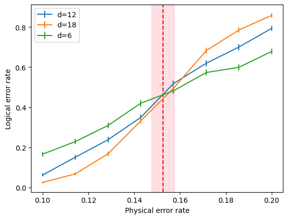
[12]:
for d in results['d'].unique():
    plt.errorbar(results[results['d'] == d]['error_rate'],
                 results[results['d'] == d]['p_est'],
                 results[results['d'] == d]['p_se'],
                 label=f'd={d}')

plt.axvline(analysis.thresholds.iloc[0]['p_th_fss'], color='red', linestyle='--')
plt.axvspan(analysis.thresholds.iloc[0]['p_th_fss_left'], analysis.thresholds.iloc[0]['p_th_fss_right'],
            alpha=0.5, color='pink')

plt.xlabel('Physical error rate')
plt.ylabel('Logical error rate')
plt.legend()
[12]:
<matplotlib.legend.Legend at 0x17ffe4370>